Minitab Case Study - Minitab Help
In this laboratory session, we are going to use Minitab to analyze some experimental data. We will first explore Normal probability plots using randomly generated data and then use these plots as a means of assessing the assumption of Normality made when we carry out t-tests and construct confidence intervals for process averages, based on small sample sizes.
1. Generating Random Data
Open Minitab and use Calc->Random Data->Normal to generate 100 observations from a Normal Distribution with mean (\(\mu \) = 0) and standard deviation (\(\sigma \) = 1). Examine the data you have generated using a Histogram, a Dotplot and a Boxplot and obtain summary statistics (Stat->Basic Statistics ->Descriptive Statistics).
Select Edit->Command Line Editor and type in the command nscores c1 c2. This calculates Normal scores for the data, which are then used to obtain Normal probability plots. Use Scatterplot from the Graphs menu to obtain a Normal probability plot. Plot c1 vs c2.
Repeat this whole process a few times to see the kind of variability that can be expected from Normal Probability plots based on samples of 100.
To see what kind of probability plots can be expected from skewed data generate 100 data points from a Normal Distribution into c1, then let c2 equal c1 squared: to do this, select Edit->Command Line Editor and type let c2 = c1 * c1. Now repeat the above process on c2. Draw a histogram, boxplot and dotplot of c2.
Repeat the whole procedure now for small sample sizes. Say 5, 10, 15 and 20.
 Need Help with Minitab? Need Help with Minitab? We can help! Your satisfaction is guaranteed. We can help! Your satisfaction is guaranteed. Our rate starts at $35/hour. Free quote in hours. Quick turnaround! Our rate starts at $35/hour. Free quote in hours. Quick turnaround! |
2 Paired t-tests.
Type the rubber data into c1 and c2 and let c3 = c2 - c1 in the session window. Column three now contains the set of differences, which we assume are random drawing from a Normal distribution. Assume for the moment that this assumption is valid and carry out a t-test of the hypothesis that the average difference is zero: this can be done using the Stat->Basic Statistics->1 Sample t sequence of menu options. The options button will allow you to construct a confidence interval for the average difference.
The test and confidence interval depend on the assumption of Normality of the differences. Construct a Normality probability plot to check this assumption. Generate a number of sets of Normal data with the same mean and standard deviation as the rubber data. Notice the variability - this should warn us not to over-intepret a Normal probability plot based on small numbers of observations.
3 Two sample t-tests
Type the yield data into c4 and c5 (or C1 and C2 of a new worksheet). Graph the data using Graph->Dotplots. What can be learned from this graph? Obtain descriptive statistics.
To do a two sample t-test and get a confidence interval for the difference between the two population means use Stat->Basic Statistics->2-sample t; select samples in different columns and assume equal variances. Interpret the output.
To obtain a Normal probability plot of the deviations from the respective means, first calculate the deviations by subtracting the means from the data. In the command line editor
let c6 = c4 - mean(c4)
let c7 = c5 - mean(c5)
stack c6 c7 c8
nscore c8 c9
Now do a scatterplot of c8 versus c9.
Tasks
Analyze the four data sets and produce a statistical report of your main findings. Your report should include for each data set,
1 appropriate descriptive statistics and graphs (10%) with commentary (10%),
2 a check on assumptions (10%) with commentary (10%),
3 results of appropriate tests and confidence intervals (15%) with commentary (15%),
4 and interpretation / summary of findings (30%).
Part 1: Generating Random Data
Two random samples with 100 observations each were created and stored in column C1. The histograms are shown below:
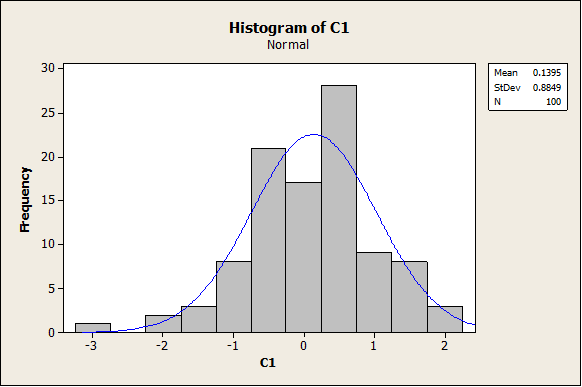
As it can be observed, the data seem to come from a normal distribution (as expected). The following graph corresponds to the Box-Plot:
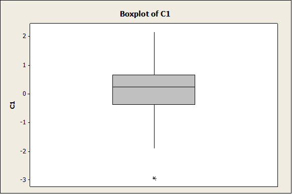
Again, the data seem to be fairly symmetric and it is consistent with the fact that it was generated as a normal sample. The dot plot is also shown below:
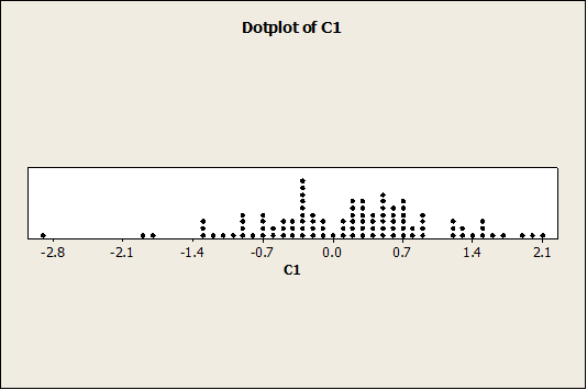
Now we have the following plot:
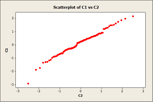
The plot doesn’t seem to depart from a straight line, which indicates that we probably cannot reject normality.
In order to assess the variability obtain for samples of size 100 we will repeat the process to get the following plot:
It can be observed that there is a degree of variability, but the normal plot still looks like a straight line for the most time.
- Now, a new sample with 100 observations will be generated in C3, but now we will create a skewed variable in C4, C4 = C3*C3. The graphs for C4 are shown below. First, the histogram:
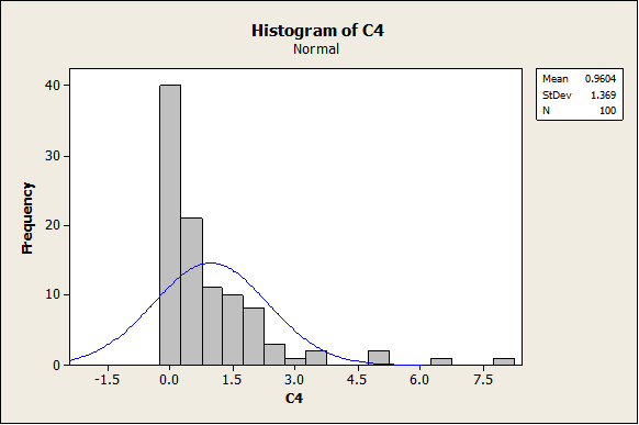
It is absolutely clear that the data are right skewed. The same is shown in the following graphs (Box-Plot and Dot-Plot)
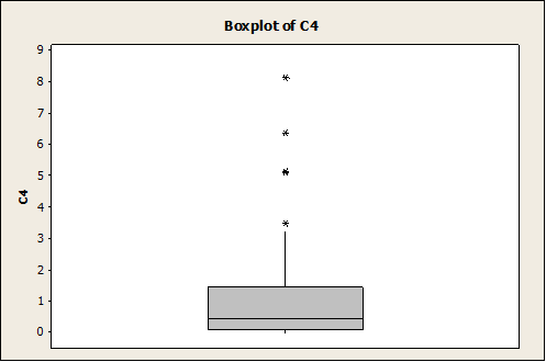
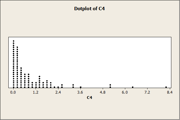
Like it was said before, the data are clearly right-skewed. Let’s see how the normal plot looks now:
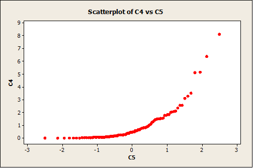
The departure from a straight line is clear, which indicates that most likely the data doesn’t have a normal distribution.
Smaller Sample
In the previous part, the data were randomly generated from a normal distribution, and since the sample size was large enough (n = 100) the empirical distribution (histogram) showed a good normality appearance. Nevertheless, when a sample is smaller, it may not be the case. Now, we are going to choose a smaller sample n = 10. We get the following graphs:
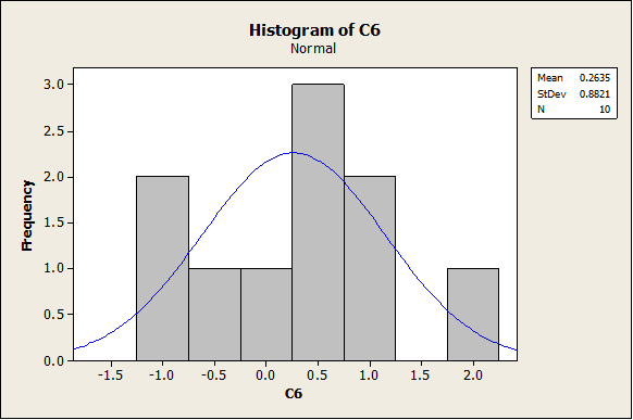
As we can see, it the histogram looks clearly less “bell-shaped” now. Same thing happens with the following graphs (Box-Plot and Dot-Plot).
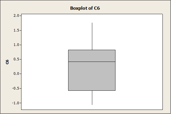
The plot above shows a clear lack of symmetry.
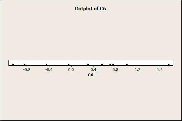
The normal plot now looks like
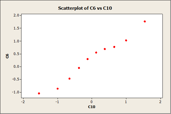
which is not completely departed from a straight line, but it is not too linear either.
Now we do the same with n = 15. First we have the following histogram:
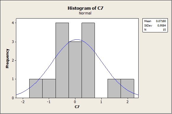
Again, the distribution doesn’t look totally “bell-shaped”. In this case, the box-plot shows a more clear symmetry than in the case n = 10:
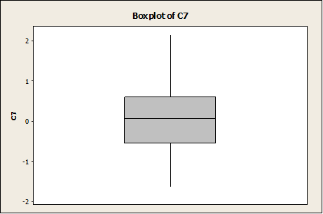
Conclusion: Even if a random sample was created from a normal distribution, the sample size needs to be large enough to have that the histogram is clearly “bell-shaped”. If the sample size is small (less than 20) the histogram may look very “not-normal”
Part 2: Paired t-test
We have the rubber data corresponding to the treated and untreated case. We need to test the following hypotheses:
\[\begin{array}{cc} & {{H}_{0}}:{{\mu }_{D}}=0 \\ & {{H}_{A}}:{{\mu }_{D}}\ne 0 \\ \end{array}\]The normality assumption will be checked later. The results of applying a paired t-test with Minitab are shown below:

The value of the t-statistics is t = 3.57, and the corresponding p-value for 9 degrees of freedom is p = 0.006, which is less than the significance level. This means that we have enough evidence to support the claim that the mean difference is different from zero. The 95% confidence interval for the mean difference \({{\mu }_{D}}\) is (0.464, 2.076). This means that there is probability of 0.95 that the true mean difference is contained by (0.464, 2.076).
Checking the Normality Assumption
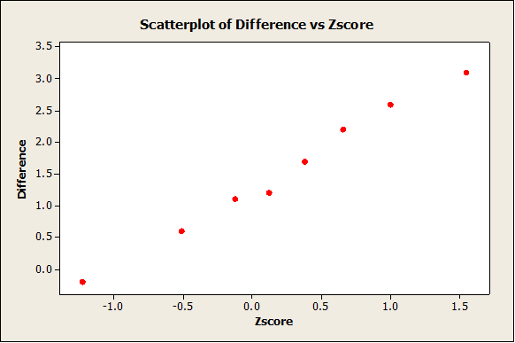
As it can be observed from the plot above, the data doesn’t seem to depart excessively from a straight line, which indicates that there is not clear evidence to reject normality.
To estimate the level of variable for sample of size n = 10, we construct a normal plot for a couple of them:
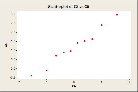
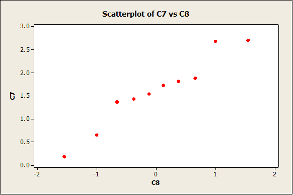
As expected, the degree of variability is not that small (due to the fact that the sample size is small).
Part 3: Two Independent-Sample t-test
First of all, we have the following dot-plots
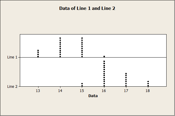
The plot above indicates that line 2 mean yield seems to be higher than Line 1 mean yield. In fact, we have the following descriptive statistics:
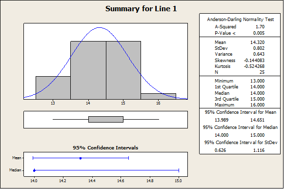
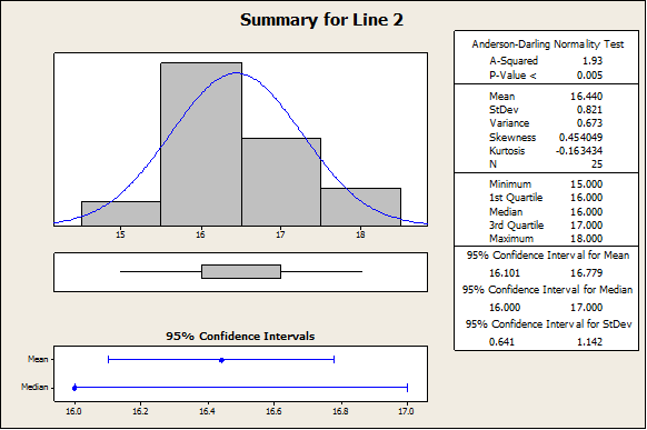
In fact, the sample mean yield for Line 2 is 16.44, where for line 1 we have 14.32. In order to assess whether or not this difference is significant, we need to apply a independent-sample t-test. The normality assumption will be checked later.
Using Minitab we obtain:
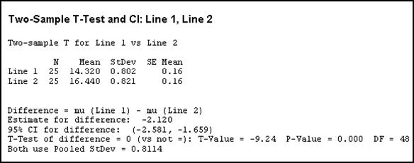
The value of the t-statistics is t = -9.24, and the corresponding p-value for 48 degrees of freedom is p = 0.000. Hence, we reject the null hypothesis. In other words, we have enough evidence to claim that the mean yield of line 1 and 2 is not the same, at the 0.05 significance level.
Verifying the normality assumption
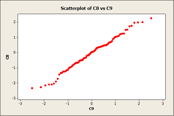
We get the following normality plot:
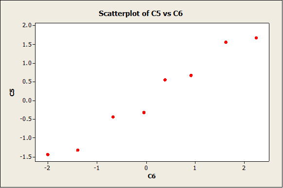
The data follow a reasonable straight line pattern, which means that we don’t have enough evidence to reject the null hypothesis of normality.
Do you have any Minitab questions? Send us your Minitab problems for a Free Quote. We will be back shortly with our very competitive quote. So, it costs you NOTHING to find out how much would it be to get step-by-step solutions to your Stats homework problems.
